A compelling government proposal isn’t just about strong content—it must also be visually engaging and well-structured to capture the evaluator’s attention. Graphic design for proposals plays a crucial role in ensuring that key information is communicated clearly, enhancing readability, and making a lasting impression. Effective use of graphics, layouts, and formatting can significantly improve a proposal’s probability of win (Pwin) by making complex information easier to digest. Furthermore, incorporating graphic design for proposals throughout the document enhances clarity and visual appeal, making the submission more competitive.
Why Graphic Design Matters in Proposal Development
Many government proposal evaluations are conducted under tight time constraints. Evaluators must quickly assess multiple submissions, making it essential for a proposal to be clear, visually appealing, and easy to navigate. Strong graphic design helps by:
Graphic design for proposals is not just a luxury; it’s a necessity in today’s competitive landscape, where every detail matters.
- Enhancing Readability – Clear headings, bullet points, and structured layouts improve comprehension.
- Highlighting Key Messages – Graphics and call-out boxes draw attention to important points.
- Simplifying Complex Data – Infographics, charts, and tables make technical information easier to understand.
- Increasing Engagement – Well-designed proposals hold the evaluator’s attention longer.
- Reinforcing Branding and Professionalism – Consistent design elements reflect credibility and attention to detail.
Key Elements of Effective Proposal Graphic Design
Utilizing graphic design for proposals can help highlight critical information, making it stand out to evaluators.
1. Proposal Layout and Formatting
A structured, well-organized layout ensures that evaluators can easily follow the proposal. This includes:
- Consistent use of headings and subheadings to guide the reader.
- Adequate white space to prevent visual clutter.
- Logical flow of information that aligns with RFP requirements.
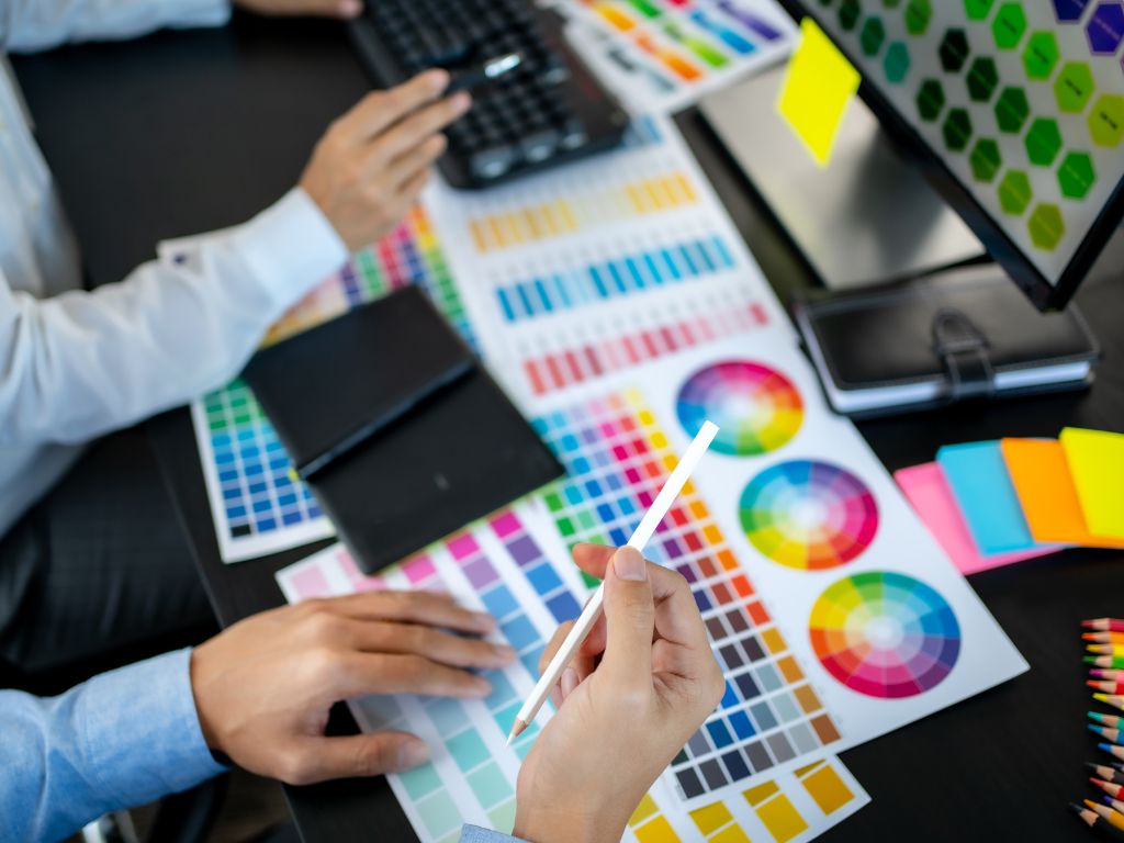
2. Infographics and Data Visualization
Proposals often contain complex data that can be difficult to interpret. Graphic design simplifies this through:
- Charts and graphs to present financials, timelines, and performance metrics.
- Process flow diagrams to explain technical approaches.
- Comparative tables to highlight differentiators between competitors.
3. Branding and Consistency
A professional proposal maintains a consistent visual identity, reinforcing credibility. Important branding elements include:
- Company logo placement on covers and headers.
- Consistent color schemes and fonts that align with corporate branding.
- Standardized icons and formatting to improve navigation.
4. Call-Out Boxes and Highlight Sections
Using graphical elements to emphasize key content ensures that evaluators notice critical information, such as:
- Win themes and value propositions.
- Compliance checklists and requirements met.
- Past performance highlights and key differentiators.
Effective graphic design for proposals ensures that even the most complex concepts are presented in an easily digestible format.
5. Cover Page and Executive Summary Design
In summary, the role of graphic design for proposals extends beyond aesthetics; it is integral to the success of the proposal.
First impressions matter. A well-designed cover page and executive summary layout should:
- Provide a clean, visually compelling introduction to the proposal.
- Clearly state the contract opportunity and response details.
- Feature a visually distinct yet professional design that aligns with the proposal’s tone.
Best Practices for Proposal Graphic Design
- Keep It Simple and Professional – Avoid excessive decoration that distracts from the content.
- Use High-Quality Images and Graphics – Ensure clarity and readability for digital and print formats.
- Follow RFP Formatting Guidelines – Stay compliant with page limits, font requirements, and submission formatting rules.
- Test for Accessibility – Ensure readability for evaluators who may be viewing the proposal on different devices.
- Maintain Version Control – Keep templates and design elements consistent across different sections and revisions.
Ultimately, mastering graphic design for proposals can lead to greater success in securing government contracts.
Common Mistakes to Avoid in Proposal Design
- Overloading Pages with Text – Break up large sections of text with visuals and white space.
- Using Inconsistent Fonts and Colors – Stick to a defined style guide for a cohesive look.
- Failing to Align Graphics with Messaging – Ensure that visuals reinforce the key themes and technical solutions.
- Ignoring Print and Digital Readability – Check that all graphics and text are clear across multiple viewing formats.
Conclusion
Graphic design for proposals is not just about aesthetics—it is a strategic tool for enhancing clarity, engagement, and evaluator retention. A well-designed proposal improves comprehension, emphasizes key differentiators, and reinforces credibility, ultimately increasing a company’s Pwin. By investing in professional proposal design strategies, businesses can create submissions that stand out in competitive government contracting environments. Contact us to learn more!